
I love grey skies and clouds—no surprise since I grew up in the Pacific Northwest. Nine months of the year beaches in the state of Washington are misty places, and it is these atmospheric conditions that provide me with much of my inspiration. But how to transfer that hazy beauty to watercolor paper? Having grappled with this problem for many years, I have a few suggestions.
First, use a limited color spectrum to mix your greys: I use ultramarine blue, cerulean blue, burnt sienna, raw sienna, and alizarin crimson. These five colors, when mixed in varying amounts, comprise my Northwest palette.
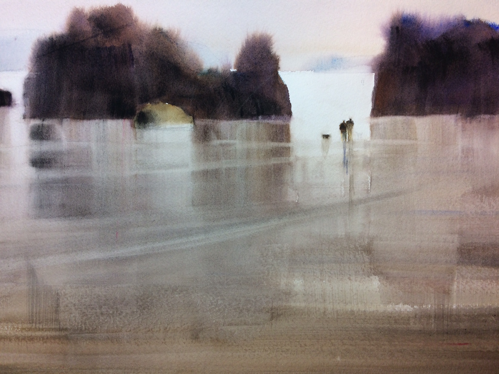
When I painted “Beach Walk” (above) I started with a dry paper, but brushed in a dilute mix of these hues down to below where the rocks would appear. Then the time factor came in. I waited until the shine had just gone off the wet paper, then brushed in a slightly darker, warmer mix for the background hills. Next I quickly filled my flat brush with very dark sienna and ultramarine blue and painted the rock shapes. Since the background was still damp, the rock edges oozed a little in places to produce a foggy look. Next I pulled down reflections while the edges were still wet. Saving white paper around the figures, I painted a more watery foreground over the top of the reflections (after they had dried slightly). The figures were painted last.
Whew! I felt like I had got it right with this watercolor, but have painted many a beach scene in the past when my timing was off and that made all the difference.
This painting is now hanging in my solo show at Tsuga Fine Art in Bothell, Washington, until March 17th
KC
I love the way you let the paint “do it’s job”! I have a difficult time letting go and not trying to control everything!! Thanks for sharing.