
Right now I have an exhibit at the Lake Forest Park Town Center Gallery and it is interesting to see which watercolors appeal most to people. i could have sold a certain “horse painting” 2 – 3 times at the Opening. Why? Maybe because of the colors. Since i had painted a lot of gray Northwest paintings, the colorful work stood out, So to accommodate the gallery I painted a few more watercolors in this genre, and brought them to the show
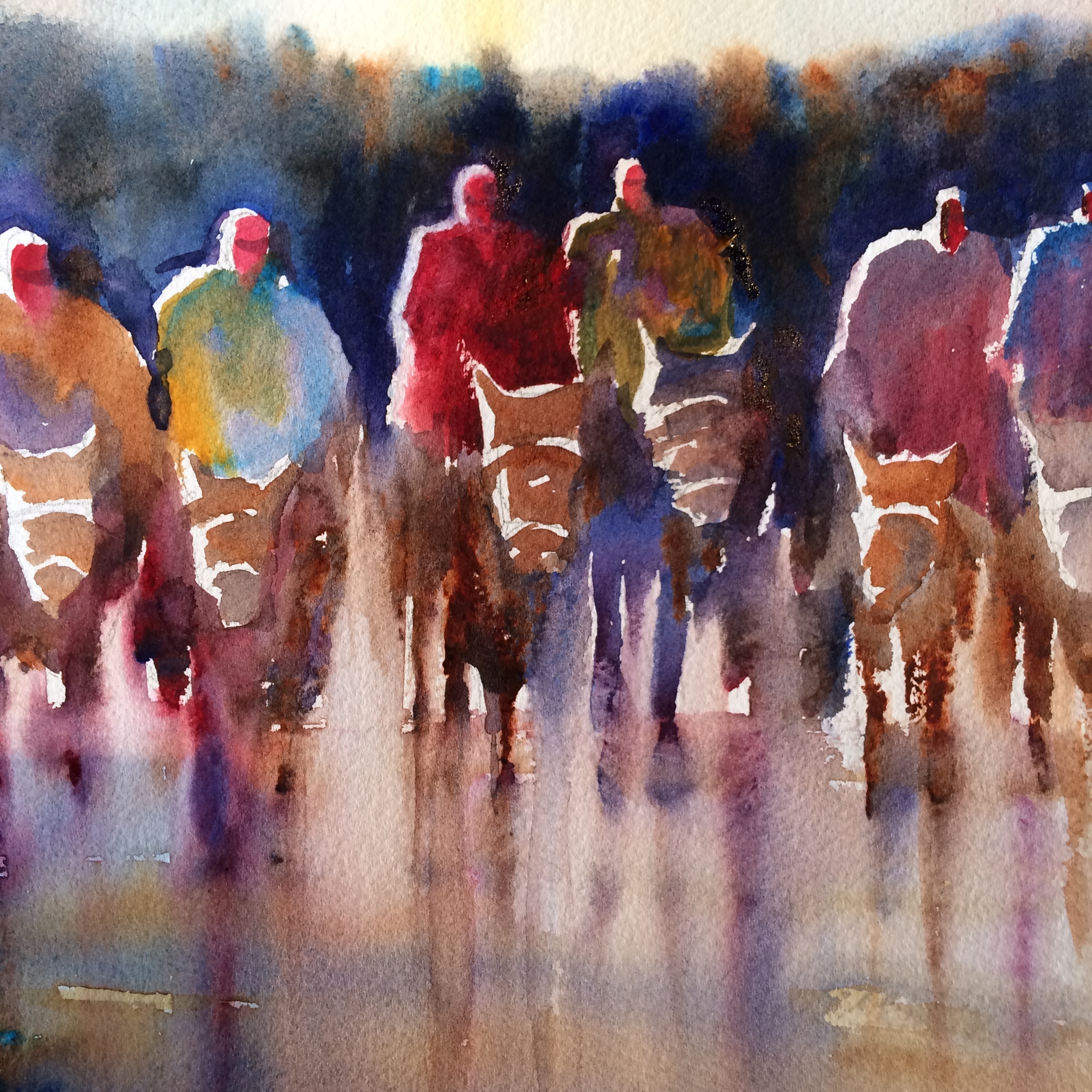
i tried to keep the design and value pattern simple: a composition of 3-layers and 3-values. With this rather plain background, I was able to go a little wild with color. I painted the sky, dark hills, and foreground mostly in raw sienna, burnt sienna, cerulean blue, and ultramarine blue, being careful to save white around the heads and shoulders of the riders.. Then it was time for fun: I dropped in alizarin crimson and turquoise for the shirts, along with swatches of the siennas and the blues..
Because the painting is composed mostly of grayed colors, the bright hues stand out. If I had painted the entire work with saturated color, it would not have the same impact and could appear harsh or garish.
KC
Excellent explanation of use of color against gray, and another very effective painting as a result!
Hi Kathy.
Gorgeous colors of the horses and riders painting. When will you be offering classes in water color at Daniel Smith in Bellevue or your studio? JoAnna Bell, one of your students has liked your classes very much.
Ill be doing demos at Daniel Smith in Bellevue Sunday March 25th!
Update–I had to postpone the demo. I’ve come down with pneumonia!
I agree Kathy. you are also careful to save your whites in the most interesting ways, showing sunlight in the mist. Such a happy painting with all the gang there. What gave you the idea for the subjects?
I saw riders on the beaches at Ocean Shores and that really inspired me