
Students in my classes sometimes ask about painting a particular scene that is meaningful to them, eg their home or a vacation spot. Quite often I notice that the photos, no matter how dearly loved, are going to be a challenge to render in watercolor. Why is that? Usually it is for the simple reason that nature does not arrange herself into good compositions for our benefit. Think of photographers who spend hours or days trying to get the perfect photo. But we painters have the luxury of being able to rearrange a setting to improve composition and values.
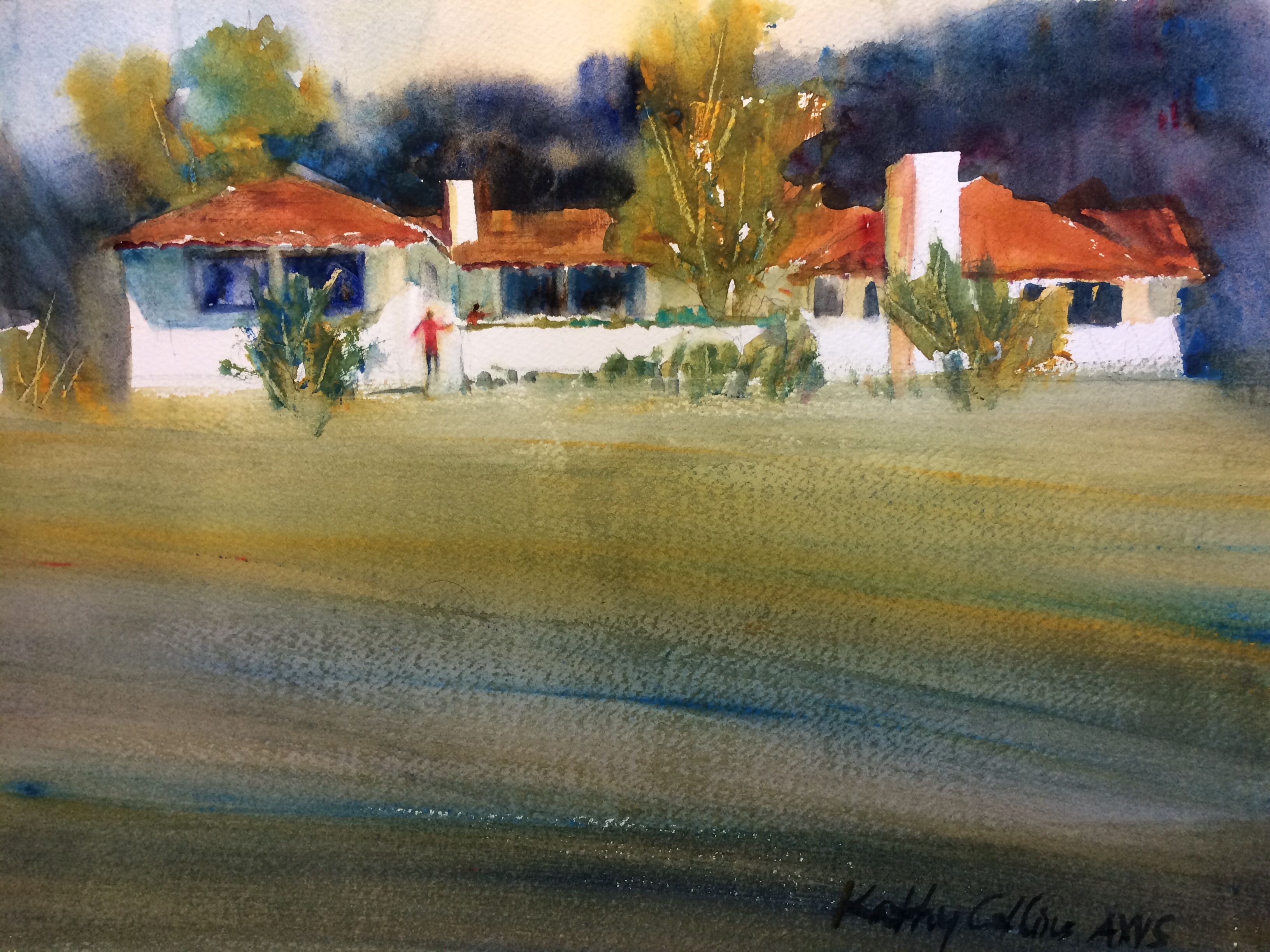
Recently I visited my son and family in Carmel Valley and painted their ranch-style home. Of course this place has special meaning for me so I wanted to get it right. But I also pondered what it was that made this structure amenable to a watercolor and others not.
First of all, the photo presented a simple composition of three layers (background mountains, building, and foreground) which led to a 3-value pattern of dark background, light house, and mid-tone grassy foreground. This was a good start, but the photo still needed tweaking before i could start a painting. First of all I whisked away extraneous stuff and just focused on the house. Then I planned to darken the background and lighten the house because the red tile roof did not present much contrast with the background. The real center of attention was to be the house and figures, so that is where I ramped up the values, making the windows nearly black and keeping the house white. The actual house is a tan stucco, so I took that color and put it in the shadows along with a little cerulean blue for cool touches. I’m fairly happy with the result because it evokes the feeling of being there without sacrificing too much artistic merit.
KC
Thanks again for your great tips. I hope you are feeling better. Today is a good day to stay indoors!! J
Now that is a nice rendition! Very lovely house. I think I will look again at the pics of my daughter’s house which she just sold and her daughters grew up in………………
I hope you are feeling better by now. Spring is in the air over here in Spokane. Lots of flowering and it is raining at the moment.
great job with the house-keeping good memories alive. thanks for all the wonderful ideas and hope you are on the mend. thinking of you and Happy Spring!