
Mt. Rainier dominates the view from the shores of Lake Washington and begs to be painted. But how to handle an icon such this?
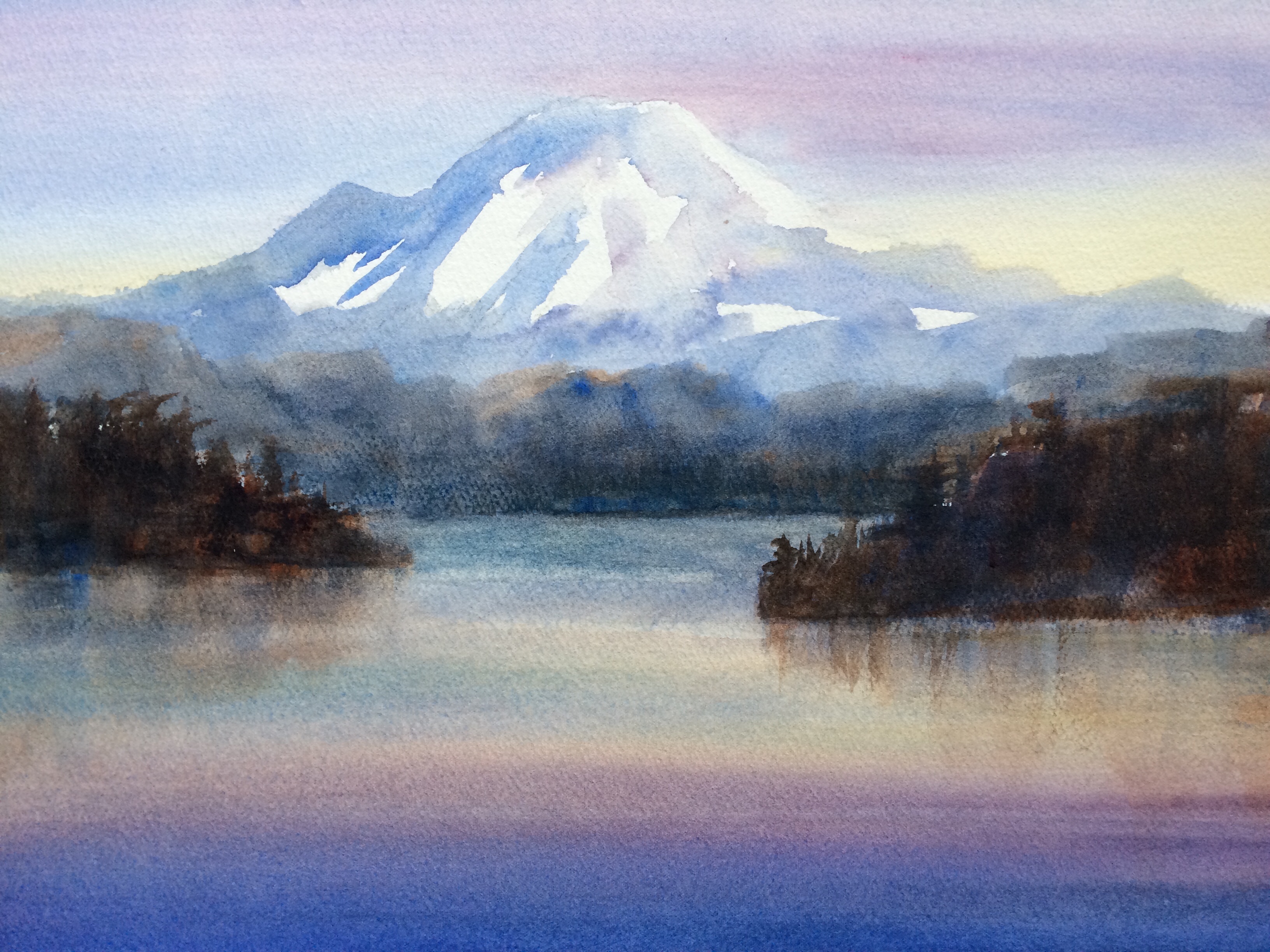
To start, I snapped a photo, printed it out, hauled out my projector, and traced the shape onto watercolor paper. I started at the top by brushing in ultramarine blue and alizarin crimson, gradating to raw sienna for the sky, while painting around the mountain. It’s 100 miles away, so the problem then became how to make it look distant, yet also be the center of interest. Anything that is bluer, grayer, and has less contrast will appear farther away. So I grayed down the ultramarine with some cerulean blue and a little burnt sienna, and began to paint Rainier, carefully leaving white spaces to represent the glaciers. The only white in the painting is the snow so there seemed to be enough contrast with the blue shadows to draw the eye to the mountain, yet not too much contrast so that it still appears far away. Next I painted the nearer land forms, gradually adding more burnt sienna to the blue paint to make them “warmer” and seem closer. Lastly I brushed in the lake waters with the same sky colors but using darker tones.
I’m happy with the mountain, but not so much with the foreground. Next time I will change the shapes of the closer land forms as they seem to be drawing too much attention.
KC
it’s lovely Kathy. Thanks, Maggie