
Achieving dark values is one of the hardest problems in watercolor. Two reasons: most of the colors are transparent, and then we add water which washes out the color. So how to get those juicy darks that contrast sharply with the white of the paper? One way is to add very little water to your brush. Just use a damp brush and dip it into the paint. Don’t use pan paint because it is dried hard and you cannot pick up much pigment. Instead squeeze out tube colors onto your palette.
Another way to get strong darks is to start with a very dark-colored paint in the first place. But using black can “deaden” a painting, so I tried using Winsor & Newton Neutral Tint and was pleased with the results. The pigment is fairly opaque and very dark gray, just like the name implies.
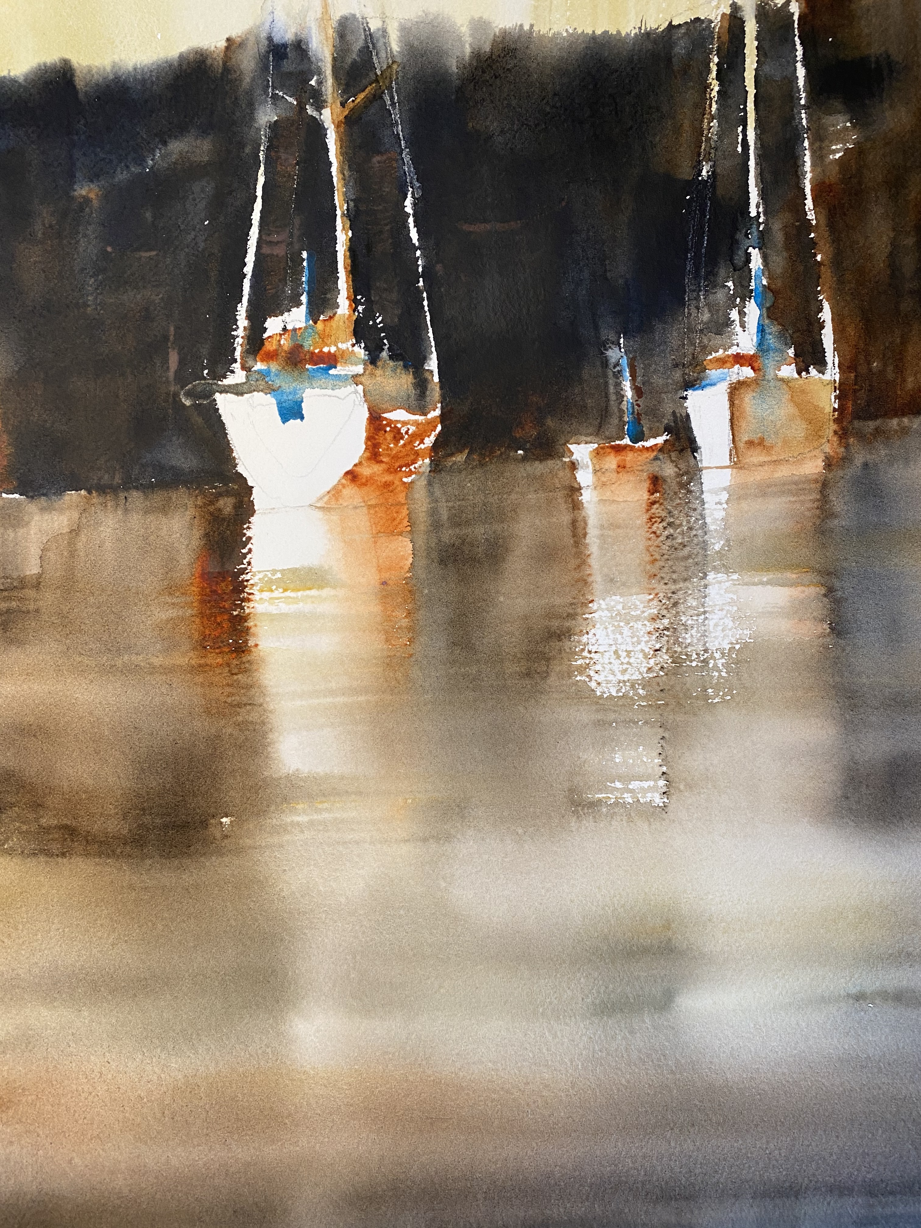
In the above painting I brushed in burnt sienna, raw sienna, and neutral tint for a warm dark background. Little dots of cerulean blue provided color and contrast on the boats. Like any color though, use it sparingly. Variation in hue makes for a more interesting watercolor.
KC