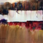
While painting from a photo of a fairly typical barn, I wanted to make the composition a bit more interesting. But how to do that? Well, there are a few tweaks to the photograph that may help. For one, start by simplifying the scene. As with most farms there was a lot of equipment and other stuff in the foreground. This I promptly threw out. Secondly, make sure that the roof and the walls are different sizes. In this case, I drew the roof larger than the front of the structure. Third, make small changes to the roof line to make it less symmetrical with bits of zigs and zags. I added a chimney to break up the long top roof line and added a little notch in the front where the white roof meets the red wall. Fourth, add some diagonals. I slanted the background treeline and also terraced the foreground into a slight incline. Finally, add a figure. I placed the farmer in one of the “sweet spots” of the composition (different distance from each of the 4 sides of the paper).
Voila! Small changes added up to a more intriguing watercolor.
KC

