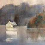
Still painting a series of Washington State ferries: but this time I made a change in the composition and decided to write about it. Notice my previous posting which shows a ferry appearing to glide right off the side of the paper. The land form echos this motion, natural for Western eyes which read text in a left to right direction. But this design violates a cardinal rule of composition: keep the viewer’s eye in the painting! So in the above work, I added a land form which acts as a “compositional stop,” meaning a shape which halts the forward eye movement and turns it back toward the center of interest.
Another problem with the design of the previous post was, to my mind, the side view of the vessel which gave it a flat look. I tried another view which showed 2 sides, allowing for shadows which could define the 3-dimensional nature of the object.
When thinking about composition I always remember an art teacher who once raised her voice, saying “Composition, composition, composition!” She succeeded in making me think about the basic importance of the design in the success of any painting.
KC


Dear Kathy, I’m appreciating so much receiving your inspirational paintings and musings, please don’t stop sharing yourself with us.
Thank you!
Thanks Kathy! The ferry is great! I grew up on Orcas and the ferries are dear to my heart.