
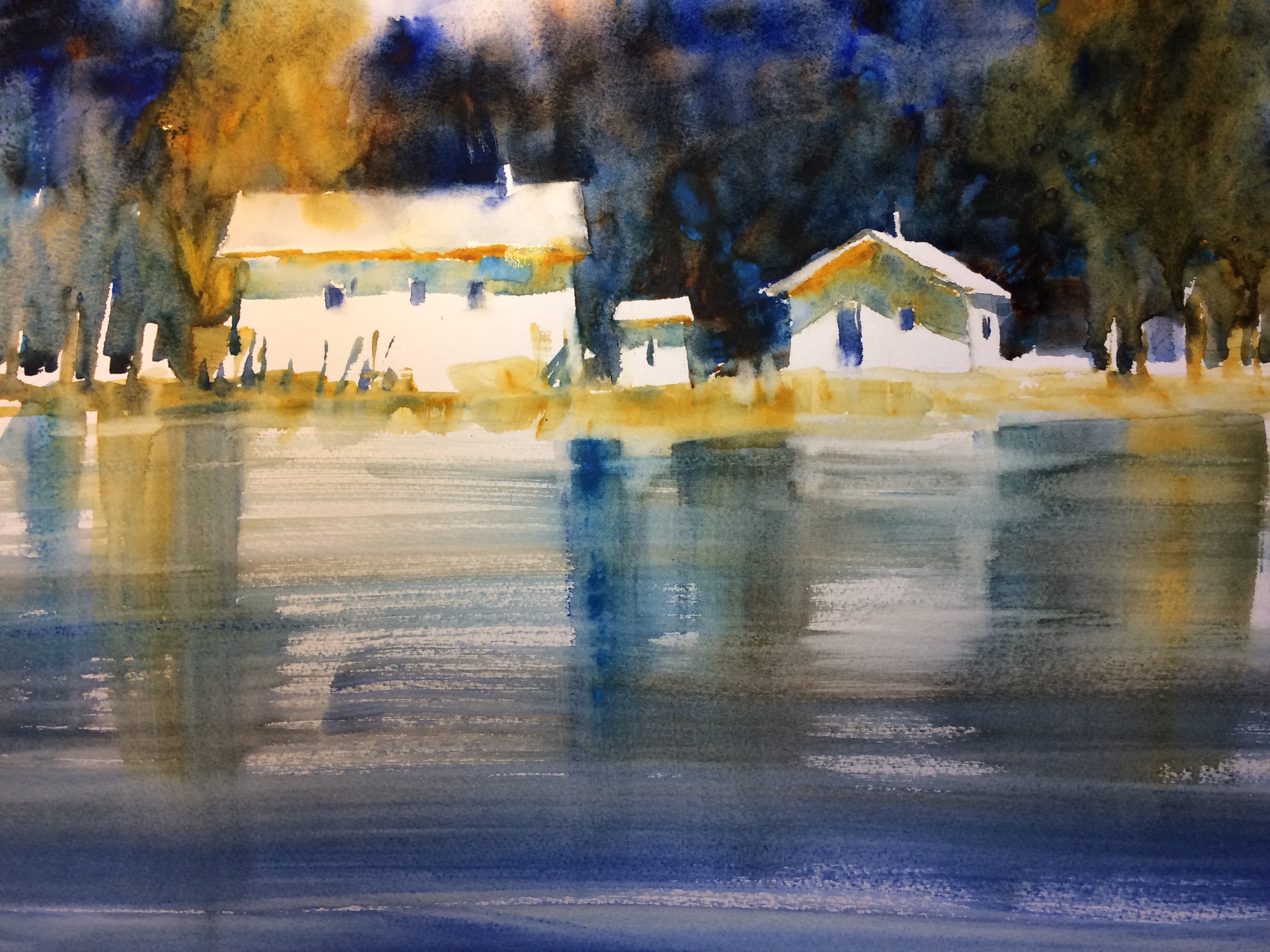
After a visit to the San Juan Islands, I began painting from my sketches. Feeling refreshed, I started a watercolor depicting the view across the bay, trying to express the feeling I had experienced during the trip. Then, after completing “Northwest Reflections,” I tried to define what qualities evoked that sense of peace. Two features came to mind: composition and color choices.
Horizontal lines support a restful design, and this watercolor is defined by its 3-layer composition and value pattern, ie top layer of dark background, 2nd layer of light cottages, and bottom layer of mid-tone water. Secondly, the hues are mainly on one side of the color wheel—greens and blues with a touch of yellow (no excitable complementary colors such as red-green, yellow-purple, etc). Green and blue usually suggest nature, which most people find inherently calming.
KC
Lovely painting Kathy! I grew up on Orcas and spend lots of time there so this painting is special! Congrats on the Splash Best of Watercolor.Thats just wonderful!