
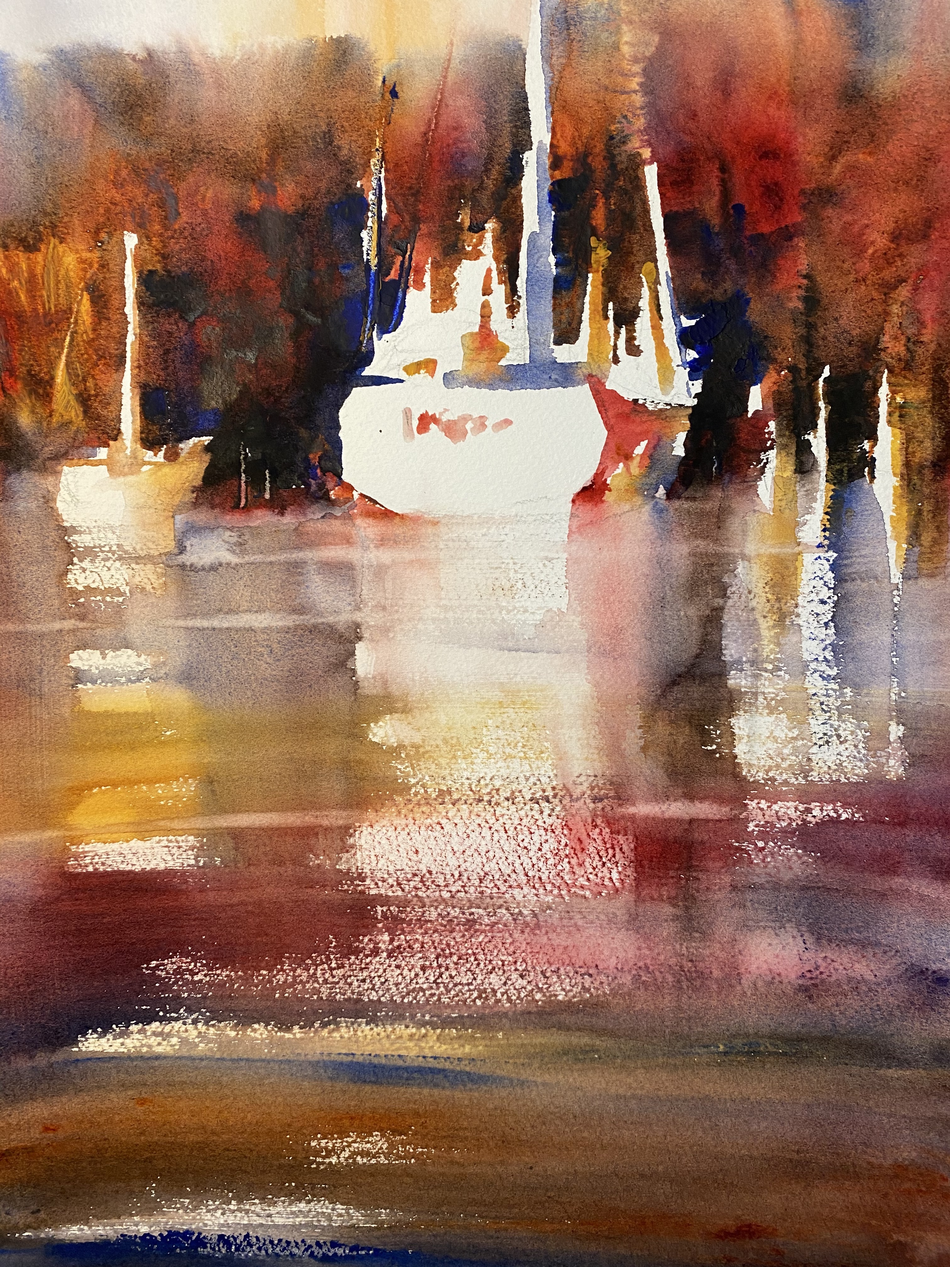
I’ve been painting boats lately and started this watercolor in my usual way—- choosing composition, value pattern, shape, and color. Beginning with a vertical 14×11 piece of paper, I divided the design into 3 unequal parts: small sky, mid-size tree background, and a large area for the water and reflections. The 3-value pattern would follow this design: light sky, dark trees, and mid-tone water. I drew boat and moorage shapes in varied sizes, the largest vessel planned for the center of interest. The boats would be left mostly white to show up against the dark background Lastly, I decided on a warm color dominance.
But this time I wanted to add a hue not usually found in a water scene—red! So I squeezed out alizarin crimson, burnt sienna, raw sienna, and sepia onto the palette, along with some ultramarine blue for contrast. I began painting with all the colors but limited the alizarin crimson because it’s a strong color that could easily take over a painting. I think the red adds a little spice without being too intense.
KC